
Drawing Week 10
This class was about learning how colours can affect our thoughts and essentially a dive into colour theory.The faculty showed us some of his abstract art work and asked us what emotion it evoked in each of us. Surprisingly,even thought it looked like random splatter on a canvas at first glance,it genuinely did create different feelings because of colour schemes and the way the colours were used.
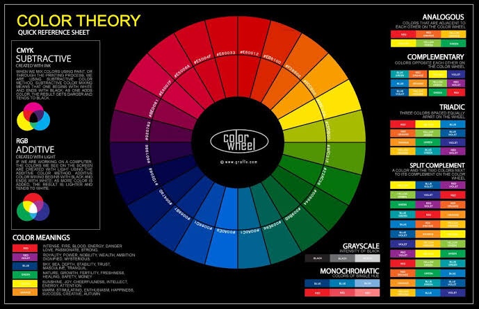
We then discussed the textbook colour theory,with the colour wheel split up into different components and how different colour schemes originate from it.We also discussed how these colour schemes were used around us as brand logos,signboards,etc.
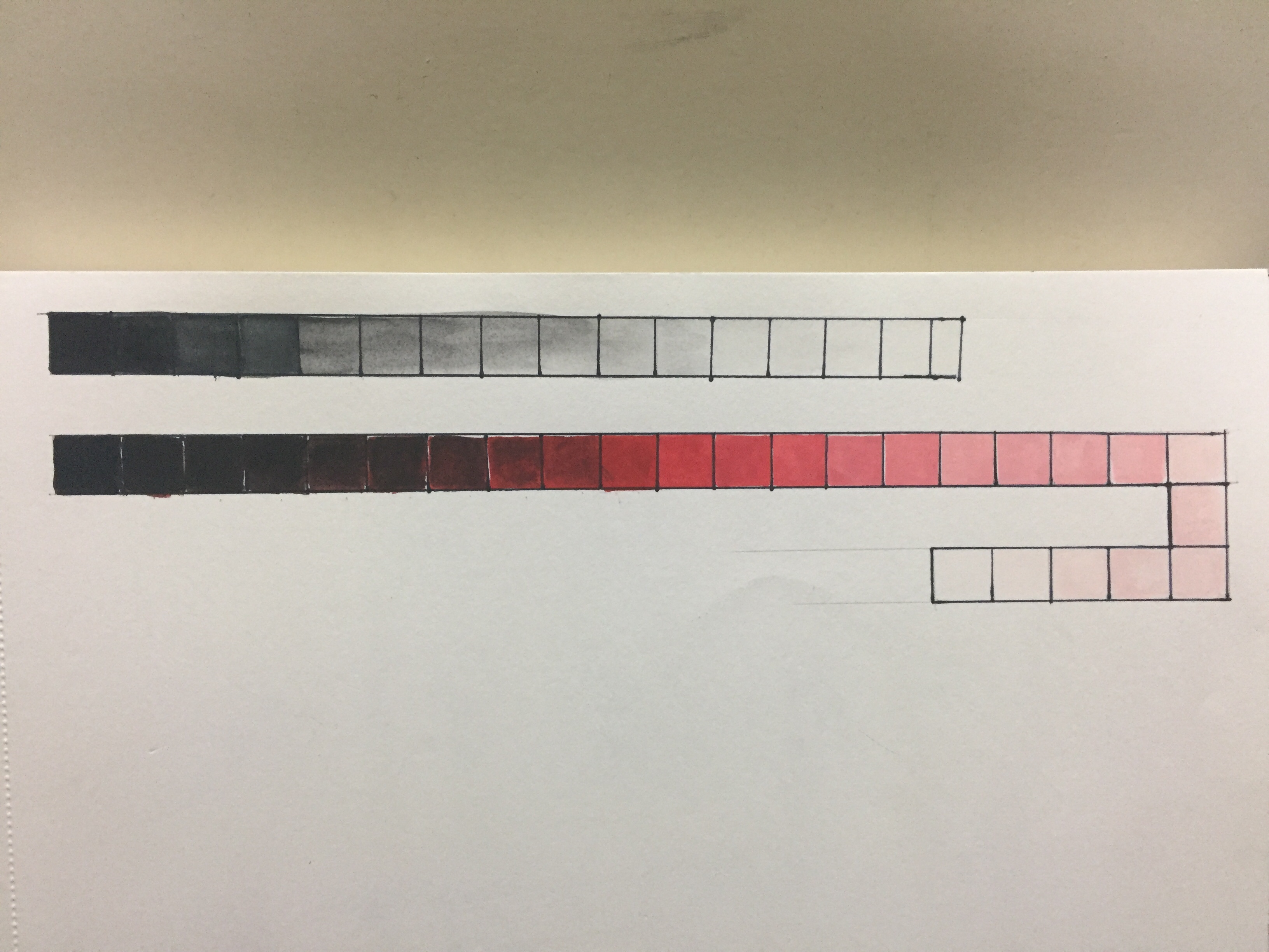
I then practiced a grayscale gradation and then changing the tint and shade of a colour.I chose a tomato red as the midpoint colour and worked both ways from there.
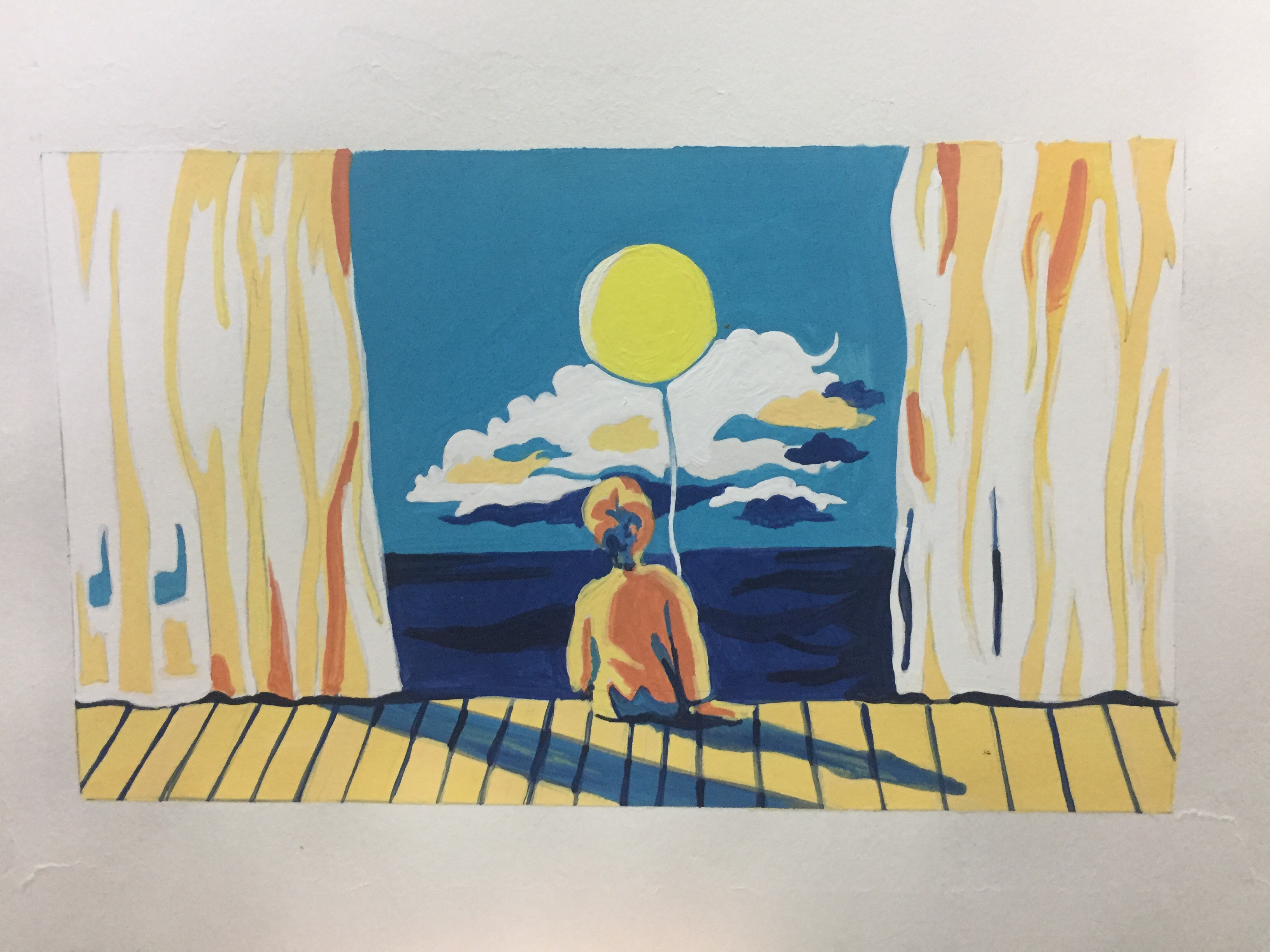
We were then told to pick a colour scheme of our choice and make a painting out of it.Personally,I am a fan of Complementary colour schemes.I feel like they have a surprise pop of colour which makes the artwork more vibrant and interesting.I chose a blue/yellow scheme for my painting.This is how it turned out: